

Case Study.
Transforming an existing logo into a cohesive
skincare brand ready for growth.
Working with Solimara's existing logo, Aura Studio developed a complete visual identity,
premium packaging system, and brand guidelines to create a consistent customer experience and prepare the brand for future expansion into Australia.
Solimara.
Visual Identity • Packaging Design

about the project.
Solimara partnered with Aura Studio to strengthen its existing skincare brand while retaining its original logo. The business had no established visual identity, with no defined colour palette or typography to create consistency across its products.
Aura Studio developed a cohesive visual identity by introducing a refined colour palette, carefully selected typography and comprehensive brand guidelines to support future marketing and packaging.
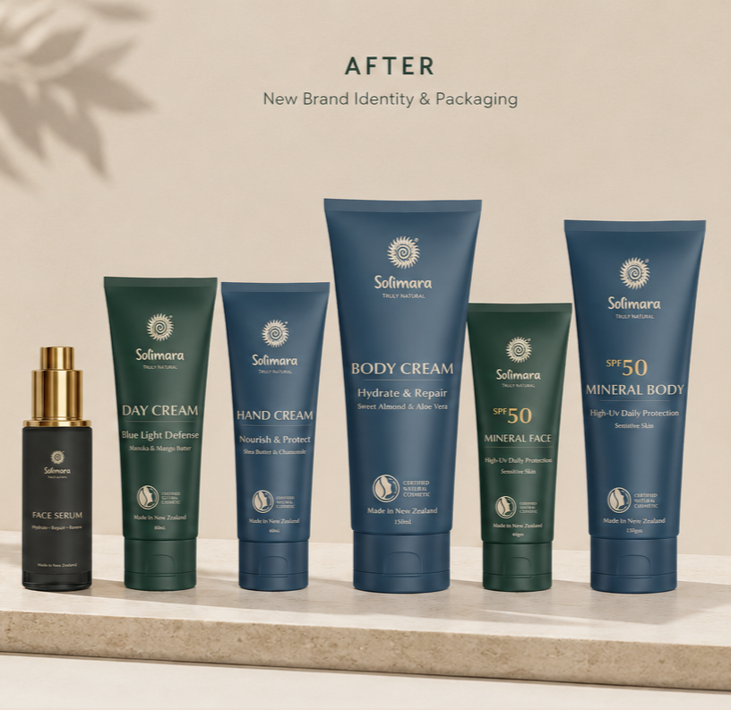
The project then evolved into a complete packaging redesign across the skincare range, creating a premium and consistent product presentation while maintaining recognition through the existing logo.
Originally developed to support the brand's planned expansion into the Australian market, the project provided Solimara with a timeless visual identity and packaging system ready for future growth.
the challenge.
While Solimara already had an established logo, the rest of the brand lacked consistency. Without defined colours, typography or visual guidelines, the packaging and marketing materials did not communicate the premium quality of the products.
The challenge was to build a complete visual identity around the existing logo without losing the brand's recognition, while creating a more refined and cohesive customer experience.
The packaging was developed to meet the expectations of an international market, helping position the brand for its planned expansion into Australia through a more premium presentation.
Creative process.
Every successful brand begins with strategy before moving into design.
Rather than redesigning the logo, the focus was on strengthening the brand around it.
The project began by exploring colour palettes, typography and visual references that reflected Solimara's natural ingredients, premium positioning and commitment to quality skincare.
Once the visual identity was established, the new design system was applied across the entire packaging range, ensuring consistency between every product while creating a modern, elegant aesthetic.
Careful attention was given to hierarchy, readability, and shelf presence, allowing the packaging to communicate professionalism while remaining clean and approachable.
the outcome.
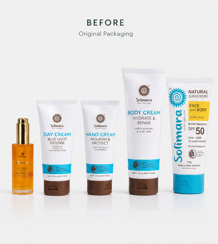
The result was a cohesive visual identity that transformed Solimara from a collection of products into a recognisable skincare brand.
Through consistent colours, typography and premium packaging, the brand gained
a stronger visual presence and a flexible identity that could support future marketing initiatives and product growth.
Although the Australian expansion was postponed, Solimara now has a complete brand identity and packaging system in place, ready to support future growth and the launch of its new packaging when the time is right.
deliverable.
Brand Identity
Packaging Design
